Introduction
In this task, we will predict wine quality using following classifier models from the “sklearn” library.
- Decision Tree
- Random forest
- Nearest neighbors
- Gaussian naive bayes
We will use these models to classify data into multiple groups of “quality” buckets. We will also compare different models and select one with best performance. To evaluate the performance of the models, we used MAE Mean Absolute Score (MAE) and accuracy score.
This task is implemented in four steps. In step 1, we explored and analysed the data set. In step 2, we implemented different models. In step 3, the task has been evaluated and performance of the models has been compared and the best performing model had been selected. In section 4 parameter tuning has been implemented to improve model performance.
The Wine Quality Data Set along with additional information about can be found on the UCI Machine Learning Repository.
Prerequisites: You should first install anaconda and all the necessary Python libraries (e.g. xgboost) on your computer that are imported below.
Now let’s get started by importing the libraries.
import numpy as np
import pandas as pd
from sklearn.model_selection import train_test_split
from sklearn import preprocessing
from sklearn import tree
from sklearn.metrics import mean_absolute_error
import seaborn as sn
#from imblearn.over_sampling import RandomOverSampler

from sklearn.metrics import mean_squared_error
from sklearn.ensemble import RandomForestClassifier
from sklearn.tree import DecisionTreeClassifier
from sklearn.neighbors import KNeighborsClassifier
from sklearn.naive_bayes import GaussianNB
from sklearn.svm import SVC
import xgboost
from sklearn.metrics import accuracy_score

import matplotlib.pyplot as plt
%matplotlib inline
1. Preporcessing and Data Analysis
In section will do the EDA. There are total 13 features of the data. The last feature “quality” is the class label which we want our model to learn about and predict. In the provided training dataset, we have data for both red wine and white wine. The “train_data.csv” file should be in the same folder as your Jupyter notebook.
data = pd.read_csv('train_data.csv') # Loading datasetWe can see that there are 13 features in our data.
# Getting peak into the data
data.head()
Check data distribution with histograms
We will plot Histogram to see the data distribution. Here we can see that quality groups for wine go from 3 to 9. We can also wee that 6 is the largest, then 5, then 7 and so on. We have total 7 outcome variables. We have a lot of values in the middle and very on the edges.
# Plotting histograms of data
data['quality'].hist()
plt.suptitle('Histogram of Wine Quality')
plt.xlabel('Quality Groups')
plt.ylabel('Number of Votes')
plt.show()
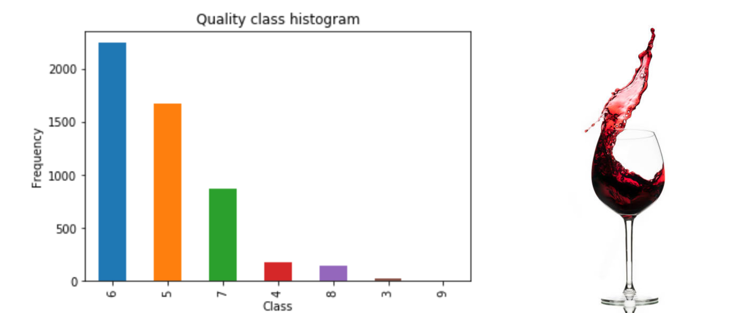
Here we have plotted the class distribution with their counts. we can see that majority of our data lies in quality of wine 6. 6 is an average quality wine consists of 2248 rows. Also the 2nd highest rows in the data are of wine quality 5. Wine 5 and 6 take majority of the instances in the dataset. The best quality wine has only 4 rows, and worst quality wine has 26 rows. This tells us a few things that we have multiple classes and thus a multi classification problem. Also there is an imbalance between the classes.
# Getting counts of instances of all classes
pd.value_counts(data['quality']).plot.bar()
plt.title('Quality class histogram')
plt.xlabel('Class')
plt.ylabel('Frequency')
data['quality'].value_counts()
6 2248
5 1678
7 872
4 173
8 149
3 26
9 4
Name: quality, dtype: int64

Checking missing or null values
# check missing data
missing_data = data[data.isnull() == True].count();
print("Overall empty data fields:" , missing_data.sum())
Overall empty data fields: 0
# See if there are null values in the data
data.isnull().sum()| fixed acidity | 0 |
| volatile acidity | 0 |
| citric acid | 0 |
| residual sugar | 0 |
| chlorides | 0 |
| free sulfur dioxide | 0 |
| total sulfur dioxide | 0 |
| density | 0 |
| pH | 0 |
| sulphates | 0 |
| alcohol | 0 |
| type | 0 |
| quality | 0 |
| dtype: int64 |
Data distribution with .info() .describe() methods
Next we will run the info() function. We can see that there are 11 float values and 2 integers. All the chemical readings are floats. The integer values are outcome variables which tell us the type of wine (red or white) and the other one is quality variable. The other interesting thing is that all values are non-null which means there are no null values in 5150 rows. So the data is pretty much clean.
data.info()<class 'pandas.core.frame.DataFrame'> RangeIndex: 5150 entries, 0 to 5149 Data columns (total 13 columns): # Column Non-Null Count Dtype --- ------ -------------- ----- 0 fixed acidity 5150 non-null float64 1 volatile acidity 5150 non-null float64 2 citric acid 5150 non-null float64 3 residual sugar 5150 non-null float64 4 chlorides 5150 non-null float64 5 free sulfur dioxide 5150 non-null float64 6 total sulfur dioxide 5150 non-null float64 7 density 5150 non-null float64 8 pH 5150 non-null float64 9 sulphates 5150 non-null float64 10 alcohol 5150 non-null float64 11 type 5150 non-null int64 12 quality 5150 non-null int64 dtypes: float64(11), int64(2) memory usage: 523.2 KB
The describe() function below will tell us an idea about the data distribution which is always very interesting to look at. The data seems clean so but we don’t see any outliers or extreme values which we have to trim. Everything looks positive here. Regarding the quality of the data, we can see that 3 is the minimum quality, which means 3 is the worst quality wine. While the maximum value of quality is 9. The mean value for quality is around 6, which is exactly between 3 and 9.
# Data districution
data.describe()
We can also have interesting look data distribution for each feature by using boxplots. In the first plot below, we have box plots for all the features and in the second box plot, we have box plot for quality. With the help of box plots we can see that there are a lot of outliers in the data which are far from majority of the distribution. In the second box plot we can see that the values 8,9 and 3 are very less, which we also saw in the above examples. We have a lot of mediocre wines.
Boxplots
# Checking Data Distribution
fig, axes = plt.subplots(nrows=2,ncols=1)
fig.set_size_inches(15, 30)
sn.boxplot(data=data,orient="v",ax=axes[0])
sn.boxplot(data=data,y="quality",orient="pH",ax=axes[1])
<AxesSubplot:ylabel=’quality’>

Correlation matrix
In correlation matrix, we see that if two features are too closely coupled. Correlation values range from 1 to -1. The color of the boxes is light if two features are highly correlated. E.g. we can see that feature ‘free sulphur dioxide’ and ‘total sulphur dioxide’ have a high correlation with a value of 0.72.
# Correlation analasys
corrMatt = data.corr()
mask = np.array(corrMatt)
mask[np.tril_indices_from(mask)] = False
fig,ax= plt.subplots()
fig.set_size_inches(20,10)
sn.heatmap(corrMatt, mask=mask,vmax=.8, square=True,annot=True)
<AxesSubplot:>

Splitting data into training and test sets
We will split our data set to make it ready for modeling. First we split the features and the target variable and then we split our dataset into training and test datasets. 70% of the data is used as training and 30% test.
# Separatiing features and labels
y = data.quality
X = data.drop('quality', axis=1)
# Splitting data into training and testing sets
X_train, X_test, y_train, y_test = train_test_split(X, y,test_size=0.3)2. Implementing Different Models
In this section we have tried different classification models to solve our wine classification problem and then we will select the one with the best performace score based on their MAE score.
print('Start Predicting...')


decision_tree = DecisionTreeClassifier()
decision_tree.fit(X_train,y_train)
tree_pred = decision_tree.predict(X_test)

rf = RandomForestClassifier(n_estimators = 50, class_weight="balanced")
rf.fit(X_train,y_train)
rf_pred = rf.predict(X_test)

KN = KNeighborsClassifier()
KN.fit(X_train,y_train)
KN_pred = KN.predict(X_test)

Gaussian = GaussianNB()
Gaussian.fit(X_train,y_train)
Gaussian_pred = Gaussian.predict(X_test)

svc = SVC()
svc.fit(X_train,y_train)
svc_pred = svc.predict(X_test)

xgb = xgboost.XGBClassifier()
xgb.fit(X_train,y_train)
xgb_pred = xgb.predict(X_test)

print('...Complete')
Start Predicting...
/home/joe/anaconda3/lib/python3.7/site-packages/xgboost/sklearn.py:1224: UserWarning: The use of label encoder in XGBClassifier is deprecated and will be removed in a future release. To remove this warning, do the following: 1) Pass option use_label_encoder=False when constructing XGBClassifier object; and 2) Encode your labels (y) as integers starting with 0, i.e. 0, 1, 2, ..., [num_class - 1].
  warnings.warn(label_encoder_deprecation_msg, UserWarning)
[21:38:04] WARNING: ../src/learner.cc:1115: Starting in XGBoost 1.3.0, the default evaluation metric used with the objective 'multi:softprob' was changed from 'merror' to 'mlogloss'. Explicitly set eval_metric if you'd like to restore the old behavior.
...Complete
3. Evaluation
After implementing the models, we can evalute their performance. Below we will see accuracy and MAE score of the models and see which one performed the best. We can see from the results that Random Forest has the best accuracy and MAE scores. So we will use the Random Forest classifer algorithm for our task.
Accuracy
print('Decision Tree:', accuracy_score(y_test, tree_pred)*100,'%')
print('Random Forest:', accuracy_score(y_test, rf_pred)*100,'%')
print('KNeighbors:',accuracy_score(y_test, KN_pred)*100,'%')
print('GaussianNB:',accuracy_score(y_test, Gaussian_pred)*100,'%')
print('SVC:',accuracy_score(y_test, svc_pred)*100,'%')
print('XGB:',accuracy_score(y_test, xgb_pred)*100,'%')
Decision Tree: 56.310679611650485 % Random Forest: 63.883495145631066 % KNeighbors: 46.47249190938511 % GaussianNB: 42.653721682847895 % SVC: 44.983818770226534 % XGB: 62.653721682847895 %
MAE Score
print('Decision Tree:', mean_absolute_error(tree_pred,y_test))
print('Random forest',mean_absolute_error(rf_pred,y_test))
print('Nearest neighbors',mean_absolute_error(KN_pred,y_test))
print('GuassianNB',mean_absolute_error(Gaussian_pred,y_test))
print('SVC', mean_absolute_error(svc_pred,y_test))
print('XGB',mean_absolute_error(xgb_pred,y_test))
Decision Tree: 0.5326860841423948 Random forest 0.4051779935275081 Nearest neighbors 0.6621359223300971 GuassianNB 0.6802588996763754 SVC 0.6330097087378641 XGB 0.42071197411003236
4. Parameter tuning for Random forest and Kaggle submission
In this section, we will try to improve select model Random Forest by tuning its parameters. We will try to plot the best value for the parameter n_estimators and we can see that it has improved the MAE score of the model.
Plotting MAE score for to estimate n_estimators
def get_mae_rf(num_est, predictors_train, predictors_val, targ_train, targ_val):

    # fitting model with input max_leaf_nodes
    model = RandomForestClassifier(n_estimators=num_est, random_state=0)

    # fitting the model with training dataset
    model.fit(predictors_train, targ_train)

    # making prediction with the test dataset
    preds_val = model.predict(predictors_val)

    # calculate and return the MAE
    mae = mean_absolute_error(targ_val, preds_val)
    return(mae)
plot_mae = {}
for num_est in range(2,50):
my_mae = get_mae_rf(num_est,X_train,X_test,y_train,y_test)
plot_mae[num_est] = my_maeplt.plot(list(plot_mae.keys()),plot_mae.values())
plt.show()
# Selecting n_estimators=40 and class_weight= "balanced"

rf = RandomForestClassifier(n_estimators = 50, class_weight="balanced")
rf.fit(X_train,y_train)
rf_pred = rf.predict(X_test)
# Checking if MAE score improves after parameter tuning
print('Random forest',mean_absolute_error(rf_pred,y_test))Random forest 0.40129449838187703
Getting test data ready for Kaggle
As our models is ready and now we can make our kaggle submission. First we input the test dataset, them remove the “id” column as its only needed for kaggle submission. After predicting test features on our model, we can put the predicted labels and the “id” column back in the submission.csv file and make the submission for kaggle competition.
test = pd.read_csv("test_data.csv")test.info()<class 'pandas.core.frame.DataFrame'> RangeIndex: 1347 entries, 0 to 1346 Data columns (total 13 columns): # Column Non-Null Count Dtype --- ------ -------------- ----- 0 id 1347 non-null int64 1 fixed acidity 1347 non-null float64 2 volatile acidity 1347 non-null float64 3 citric acid 1347 non-null float64 4 residual sugar 1347 non-null float64 5 chlorides 1347 non-null float64 6 free sulfur dioxide 1347 non-null float64 7 total sulfur dioxide 1347 non-null float64 8 density 1347 non-null float64 9 pH 1347 non-null float64 10 sulphates 1347 non-null float64 11 alcohol 1347 non-null float64 12 type 1347 non-null int64 dtypes: float64(11), int64(2) memory usage: 136.9 KB
# Dropping extra 'id' column
test_features = test.drop('id', axis=1)
# Predicting kaggle test data
rf_pred = rf.predict(test_features)Making submission.csv
my_submission = pd.DataFrame({'id': test.id, 'prediction': rf_pred})
# you could use any filename. We choose submission here
my_submission.to_csv('submission1.csv', index=False)
