In this tutorial, we are going to implement hierarchical clustering on iris dataset in python. We will implement the hierarchical clustering in 3 simple steps which are loading data, implementing the model and visualizing the clusters. We will not analyse data or plots in this tutorial, as our main goal here is the Jupyter notebook style implementation and code in python.
We will start with the our 4 imports.
In [1]:
from sklearn import datasets
from sklearn.cluster import AgglomerativeClustering
from scipy.cluster.hierarchy import dendrogram, linkage
import matplotlib.pyplot as plt
From sklearn, we imported datasets to load iris data and AgglomerativeClustering to implement the model. We also imported deprograms and linkage from scipy library. In the model section, we will see what are they. And the last import is matplotlib for making plots.
1. Loading data
After imports, our first step would be to simply load the iris dataset. We will simply do with the by loading it from the sklearn datasets. Then we will split the features and the labels in the iris data because we won’t need the data labels for model implementation, because hierarchical clustering is unsupervised learning. At this point our data is ready for model implementation.
In [2]:
iris = datasets.load_iris()
In [4]:
# separate features and class labels
X_features = iris.data
y_labels = iris.target
2. Model implementation for hierarchical clustering
Our next step is to implement the model. First we will initialize our AgglomerativeClustering
model with the parameters. The first parameter of our model is linkage. The default value of linkage = “ward”.
In [5]:
model = AgglomerativeClustering(linkage="ward", n_clusters=3)
The linkage parameter finds which distance criteria should be used between the data points. The model will combine the sets of clusters that minimize this criteria. We can assign 4 values like ward,average, complete or single to the linkage parameter. The next parameter is n_clusters=3. Which is how many clusters we want to find in data.
After initializing the model, we will fit our data features into the model. And that’s it. Our model is ready at this point.
In [6]:
model.fit(X_features)
predicted_labels = model.labels_
We will next print the predicted labels made by the model. As we can see in the label values, the model has predicted 3 clusters with the values 0, 1 and 2.
In [7]:
predicted_labels
Out [7]:
array([1, 1, 1, 1, 1, 1, 1, 1, 1, 1, 1, 1, 1, 1, 1, 1, 1, 1, 1, 1, 1, 1, 1, 1, 1, 1, 1, 1, 1, 1, 1, 1, 1, 1, 1, 1, 1, 1, 1, 1, 1, 1, 1, 1,1, 1, 1, 1, 1, 1, 0, 0, 0, 0, 0, 0, 0, 0, 0, 0, 0, 0, 0, 0, 0, 0,0, 0, 0, 0, 0, 0, 0, 0, 0, 0, 0, 2, 0, 0, 0, 0, 0, 0, 0, 0, 0, 0,0, 0, 0, 0, 0, 0, 0, 0, 0, 0, 0, 0, 2, 0, 2, 2, 2, 2, 0, 2, 2, 2,2, 2, 2, 0, 0, 2, 2, 2, 2, 0, 2, 0, 2, 0, 2, 2, 0, 0, 2, 2, 2, 2,2, 0, 0, 2, 2, 2, 0, 2, 2, 2, 0, 2, 2, 2, 0, 2, 2, 0])
3. Visualize the Dendrograms
After model implementation we will visualize our data features using dendrograms.
In [9]:
linkage_matrix = linkage(X_features, 'ward')
plot = plt.figure(figsize=(14, 7))
dendrogram(
    linkage_matrix,
    color_threshold=0,
)
plt.title('Hierarchical Clustering Dendrogram (linkage=ward)')
plt.xlabel('sample index')
plt.ylabel('distance')
plt.show()

In the above code, we have initialized the linkage_matrix variable by fitting our features to the linkage method and kept the default value for the linkage value as “ward”. Next we have passed the linkage_matrix to the dendrogram method. The rest of the code is regular code for a plot.
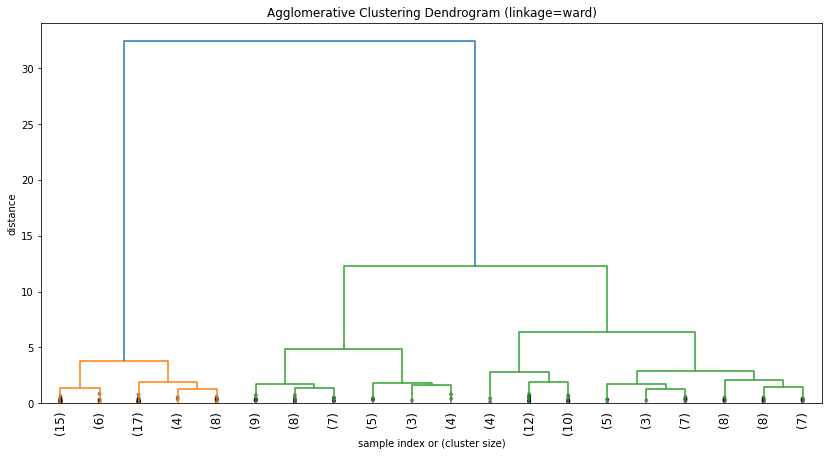
We have the data points at the x_axis and the distance at the y_axis. We can see the data points along x_axis are crowded and not readable at all. In the next code, we are simply making our dendrogram neat and clean. We did that by simply using 20 points of data at the x-axis instead on putting all data points along x-axis.
In [16]:
plot_2 = plt.figure(figsize=(14, 7))
dendrogram(
    linkage_matrix,
    truncate_mode='lastp',
    p=20,
    leaf_rotation=90.,
    leaf_font_size=12.,
    show_contracted=True,
)
plt.title('Agglomerative Clustering Dendrogram (linkage=ward)')
plt.xlabel('sample index or (cluster size)')
plt.ylabel('distance')
plt.show()
That’s it.
